

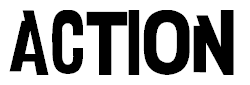
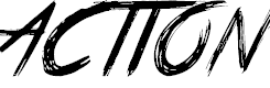
They each fit the film but they each represent the film in a different way, the top right one is very bold and would fit a superhero movie becuase of its big letters, the bottom left one would fit a horror film more because of its font, it looks like someone has written it very frantically. The bottom right one would fit the film quite well and I like how it has little sections cut out of each letter so it is not your usual font.
No comments:
Post a Comment